Showing posts with label Hex Games. Show all posts

Tuesday, October 18, 2011

All Stars: Vice Squad

Cover art for the All Stars vice squad game supplement coming soon from Hex Games.

This is actually the second cover in the All Stars series, the first one was by the super talented Lindsay Hornsby. I didn't try to match her art style, but did use her color palette. It was strange seeing the color choices that another artist used and thinking about how I would have done it differently. The two biggest differences are that her skin tone is very yellow while mine leans more toward reddish orange. And the over all tone is purple, where I usually go with a dark blue or red.

Like I said, the differences are interesting to me. Hope you like it!

Sunday, August 28, 2011

All Stars


Recently, I did some interior art for a new release from Hex, "All Stars", A game of low-budget superheroics. Basically, it's a game about the other guys. The super heroes that just didn't quite make it. Think "The Tick" or "Mystery Men". At any rate, this project was a lot of fun.

You can purchase your very own copy, written by Steve Johnson, with cover art by the talented Lindsay Hornsby, and interior art by Leighton Connor, Josh Burnett, and myself here.

Until next time, take care and be good!
Your friend,
Jeffrey

Tuesday, August 23, 2011

A Little Bit of Process

As promised, here's a little bit of my working process. This isn't everything, because I'm not including my initial thumbnail sketches or any of the work on the logo, and I'm terrible about actually documenting what I do during the painting process...but it'll have to do for now. ha-ha-ha!

First I get the brief, and (usually) a copy of the current version of the text. Depending on who I'm working for, the brief can be more or less specific. Ian is usually pretty specific about his ideas, but is also pretty cool about letting me choose from his list of things. The cover brief for Edison force looked like this:

In the grand tradition of Fratboys, I like the idea of a host of evil rising up. Some things that might be good

In the midground

Luther Burbank with his vegetable minions

Marie Curie with her radium gun

J. Pierpont Morgan and his accountant henchmen

An X-ray image of a man

Nicholas Roerich seated crossed-legged in midair using the power of Shambala to levitate

An early tank

In the air maybe an evil black dirigible, pterodacyls—small, far off

In the background,

an ominous black figure, backlit by a sparking Tesla coil

In the foreground,

a ca. 1908 Thomas Edison backed by a team. Maybe a Roosevelt look-alike, an Annie Oakley, a guy in a leather flying helmet, a kid working a crystal set.

So as you can see, he gave me a lot of ideas to work with.


The first thing I do is start gathering reference. Mostly I'm looking for photos to cover the specific references, as well as poses, attitudes and inspiration. My reference files can get pretty big.
Like I said, I didn't scan the initial thumbnail sketches I did, exploring composition and content, and now I don't know where they are. This is my initial pencil drawing. Nothing too special, I use a 2h pencil for the initial lay in, and then go back over part of it with a 1 or 2b, to darken and finalize things.
After scanning in the pencils, I went ahead and did a composite using the graphic elements that I knew would be going into it. Basically, I wanted to make sure everything fit before putting too much work into the project.
Next I ink the pencil drawing. This defines all the major areas, as well as adding some textures and details to objects.
Finally, I color everything. Here's a detail of what the colors look like both with and without the inked lines.

One of these days I'll get more of a tutorial post together. The problem is that I'm still learning a lot with each new cover, so I don't always do it the same way. Hmmmm... Maybe that's the way it is with everybody though. I hope you all got at least some peak into the way I work through this.

Until next time, take care and be good!
Your friend,
Jeffrey

Saturday, July 23, 2011

Edison Force!!!


Well, July is coming to an end, and with it will come the release of Edison Force from Hex Games!

This is probably my favorite cover to date...I guess that makes sense since it's the most recent, but I think there's more to it than that. I enjoyed the research and inspiration phase of it very much, and also the writer Ian gave me a lot of ideas to work with for what he wanted on it. So many ideas in fact, that I had to sift through them and unfortunately had to end up leaving a lot of them out.
I've been wanting to do a more in depth post talking a little bit about the way I work and develop my ideas lately. I'm not making any promises because I have a lot of other work to do to get ready for Archon, the holiday season at Fusion, and (hopefully) the Small Press Expo this fall, but I think I may put together something with this cover to kind of show it from start to finish.
The boy with the electric rifle was the first illustration that I did for this project. This is actually the second version of this drawing, as I felt that in my first go he was a little too old. The game is set in the turn of the 20th century, and revolves around a lot of electrical, steam/diesel punk technology. I felt (and I think this may have been Ian's intention) that there would be a lot of kids working for Mr. Edison's organization.
Diamond Jill and her Electric Handgun. I struggled with this one, wanting to do more of an "adventurer" design, until I realized that she really should be more subtle...like a member of the upper-class. Or at least a LADY, and not just some street urchin like the boy with the electric rifle. I imagine that she normally wouldn't use her electric handgun unless she was cornered, and that's why she's just a bit disheveled.
What game about turn of the century super-spies and mad scientists would be complete without a radio controlled monkey?

That's it for today. Until next time, take care and be good.
Your friend,
Jeffrey

Sunday, February 27, 2011

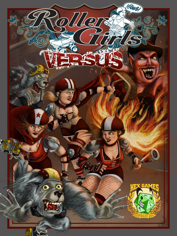
Roller Girls Versus

I noticed today that it's managed to be two weeks since I posted last...wow. To be fair though, there are a couple of posts by me over on the handmade family blog, so you could go check that out, follow it, and suggest it to all your friends, acquaintances and family if you want. Or you could just go check it out. There's some pretty cool stuff, and my wife is putting up content about her work too, so that's pretty rad... and I'm better about putting pictures of the girls on there too, ha-ha-ha!

Okay, on to the real reasons (excuses) for not posting in two weeks. First, we've been accepted as vendors in a local hand-made cooperative, Fusion. More on that in the next couple of days, as we're working like crazy to get ready for set-up (I'm supposed to be designing our signing right now, actually). The second reason, is this new cover for the fine folks at Hex Games... Roller Girls Versus! I decided to take a different approach to it, and it kind of blew up in my face and took way longer than it should have. On the plus side though, I think I learned a couple of lessons and maybe earned a couple of experience points towards leveling up. I'm not going to jabber any more tonite, because I'm pretty beat, and still have work to do before bed.

Here's the pencils.
and here's the colored version. I pretty much just painted over the pencils this time, but there's a lot more going on than usual. Like I said..."trying something new". Ha-ha-ha! I hope you all like it.
Until next time, take care and be good.
Your friend,
Jeffrey

Monday, November 1, 2010

The Last of the Frat Boys Posts... Probably.

I've gotten into the (maybe terrible, but the jury is still out) habit of sitting and reading (and reading, and reading) blogs when I come down to the basement to work. I only say that it's (maybe) terrible, because it means that I end up staying up until three (or five) some mornings... My time management skills could use some managing, I think.

Okay, so here's one of the things that has kept me up this week... I'm sure you all are tired of hearing about the artwork for "Frat Boys: Versus" (Due out in November from Hex Games). Well, I finally got the cover all purdy and colored.

Here it is without all the title and copyright graphics. I'm overall happy with how it turned out. I think if I had it to do all over again, I'd probably color the background characters a little more graphically with flat colors and cell-style shading, but that's really neither here nor there.

Here it is with the title and copyright logos added. I wanted to keep it pretty simple and collegiate.

Until next time, take care and be good!

Oh yeah, and DON'T FORGET TO VOTE!

Your friend,
Jeffrey

Monday, October 25, 2010

Frat Boys Interior and cover inks

I know what you're probably saying... "More frat boys?! Geesh!" Almost done, I promise. This week, I got one last archetype, and finally the inks for the cover. Hope you like 'em!
The final archetype I have for you is the ring leader. This character archetype can vary wildly, but the constant is that he's charismatic, and perhaps a bit mischievous, but above all, he holds everything together. Examples include Anthony Edwards character in "Revenge of the Nerds", Val Kilmer in "Real Genius", and Ryan Reynolds in "Van Wilder". I based mine in part on Jeremy Piven in "PCU", and Bill Murray's unforgettable Peter Venkman in "Ghostbusters". Cast as Justin Bateman, I think he'd be charming, strong, and capable of being sardonic when the situation required it of him.
I have never liked "Scooby-Doo". There... I said it. I've always thought it was a cool idea, but ultimately, it was the same old show over and over again, and honestly it wasn't that entertaining the first time. I did like the intro, however... THAT was cool. Four kids and their dog on an adventure, being chased by monsters. Cool. So, that's what I had in mind when I was drawing the cover art for Frat Boys -Versus-. What would Scooby-Doo be like if it was cool. It's got everything from redneck truckers, to ostriches, to zombie girl-scouts, and even an astronaut with a sword!

Okay, so maybe my idea of cool and everybody elses is different. At any rate, I'm pretty excited about how it's coming along.

Until next time, take care and be good.
Your friend,
Jeffrey

Monday, October 18, 2010

Frat Boys Interiors

So, I was going to post about something else tonight, but I really have too much other work on my desk, and didn't manage to get all the artwork for that post done. There's always next week though, right?

I figured that instead I would share with you a couple more of the character archetypes for the "Frat Boys -Versus-" supplement for the QAGS game system that is due out before the end of October.

First up is the Party Animal. Most often, when I think of the party animal archetype, I think of John Belushi in "Animal House". I thought it would be kind of funny to cast him as Seth Rogan, and strap a keg on his back as his zombie-killing weapon-of-choice.

When I think of the Outsider, honestly I think of the black running-back in "Varsity Blues". At any rate, I thought it would be cool to have the person who was different from all the other pledge brothers be... A girl. Not just any girl would do though, so I cast Rosario Dawson. Steve said something to the effect of "I don't know what she's going to do with the beer-bong, but I have a feeling it'll be awesome."

Finally, on a semi-related note... RPGnow is offering $700.00 worth of gaming PDFs for $25 dollars. All the proceeds go to Doctors Without Borders. So if you like games, and you like saving a lot of dollars, and you like helping others save lives, go check it out! One of the pdfs in the offer is American Artifacts, by Hex Games.

Until next time, take care and be good.
Your friend,
Jeffrey

Monday, October 4, 2010

Archon 34 (Or My Weekend With Hex, Dice, and Video Game Geeks)

Okay, saying "Video Game Geeks" is a little misleading. While being a role-playing gamer and a video gamer are not mutually exclusive, neither are they necessarily the same thing. I really just wanted a clever title for once. Ha-ha-ha!

Archon 34 was a blast. I got to meet a lot of really cool people (Like Steve Dixon here, in his incredible Jek Porkins Costume) as well as hang out with some older friends. Archon is a science-fiction and fantasy convention that centers around the gaming aspect of the hobby. 3000(ish) gamers and fans take over a portion of the Saint Louis (This year it was West Port) area for the weekend and play games, talk, wear costumes and drink and dance. What's not to love?

Aside from the gaming aspects of the convention, there is also an art show, providing an opportunity to showcase some really fantastic artwork, as well as maybe sell some of it.

This is the reason I missed two posts last week. I was proud of myself for working ahead (and am glad for the head start it gave me) but still ended up scrambling on Wednesday and Thursday to finish getting everything together. I'm really pleased with the spread of work that I was able to present, but think that next year I'll try to have more color images to show. Hopefully next year they'll have the artists alley again as well, and I'll get a table to talk to interested peoples from behind. And maybe sell a thing or two as well.

And finally there were the guys from Hex games. Had a great time hanging out with them and playing their games. I got to sit as a panelist on a couple of their panels (World Building, and Magic: You're doing it wrong) which was both fun and informative. I'm excited about some of the upcoming projects we discussed for the upcoming year as well.

So. To sum up. Archon 34 was great. The Art Show looked really good, and while I didn't sell anything directly through it I am glad that I did it and hope that the publicity will send some work my way. Made some new friends and contacts, as well as got to see some old ones. Oh yeah, and got to play some AWESOME games by the guys at Hex using the QAGS system, available at hexgames.com as well as DriveThruRPG.com. Go buy and play them today, and have some fun yourselves!

Who needs high school reunions anyway?
Until next time, take care and be good!
Your friend
Jeffrey

Monday, September 27, 2010

American Artifacts: The Car Hank Died In

I think the quote is "If you draw it, then you know it". I'm not 100% sure that I got the words right, but the spirit of the quote is there. Iain McCaig, a fantastic concept artist and illustrator said this in relation to forming new ideas, and drawings. Basically, it means that nothing grows in a vacuum (except dust-bunnies) and that even the most bizarre creation is based on SOMETHING that already exists. So. Part of our job as artists it to not only draw some fantastical stuff, but also to draw a lot (sorry, I meant A LOT) of regular stuff. This helps limber our arms and hands. It develops our eye. It stretches our minds, and builds a visual vocabulary of parts to pull from.

A few months ago, I did some art for the fine folks over at Hex Games for a supplement called "American Artifacts" (Have you bought your copy yet? It's really good, you should really look into it). I only did one interior illustration for it, but all of the artifacts were so cool that I wanted to do more. In the spirit of adding to my visual Vocabulary, as well as my portfolio, and hopefully to get some rad promo stuff together as well, I started drawing the other 19 artifacts. The first is the car that Hank died in... Referring to the great country singer Hank Williams sr.

From Wikipedia:

On January 1, 1953, Williams was due to play at a New Year's Day concert in Canton, Ohio, but he was unable to fly due to weather problems with snow and ice in Ohio. He hired a college student, Charles Carr, to drive him to the concerts he was to perform during the few final days of 1952 and early 1953. Upon leaving the Andrew Johnson Hotel in Knoxville, Tennessee, Williams apparently had injected himself with some pain-killers which included a morphine/Vitamin B-12 combination. Also found in the Cadillac convertible were some empty beer cans and the handwritten lyrics to a song yet to be recorded. According to some, Williams was carried semi-conscious to his automobile by Carr and a hotel employee, who wondered about Williams' condition, and later believed he might have been dead at that point.

In a slightly different version, Carr suspected Williams was moribund at some earlier point, but realized the great singer was dead several miles before entering the town of Oak Hill, West Virginia where he, almost in a panic, pulled up to the gas station to seek help.
My wife tells me it looks like the car's hit him. Admittedly, the whole "Spirit leaving the body" aspect of this illustration is a little shaky. I know what's going on, but that's because I drew it, Ha-ha-ha! At any rate the drawing was more about the car anyway, and I actually am really happy with how that turned out. I think the next one is the the car that won't die. I have an idea for it, and it should be good, but I need to see if they have "The Blues Brothers" at the library.

Until next time, Take care and be good!
Your friend,
Jeffrey

Monday, September 20, 2010

Some interiors for Frat Boys -VS- coming soon from Hex Games


The Guys at Hex are so good about letting me decide what I'm going to illustrate. Usually there are some guidelines or ideas for what they are looking for, but I feel very fortunate that they trust me enough to say basically "Here's the text, draw something cool."

My only direction was that they wanted a feeling of the setting, and maybe a party at the frat house. I decided to do the drawings based on frat boy archetypes (Jock, Nerd, Outsider, Party Animal, and Ringleader), showing bits of frat life (the partys, the house, the trash... the potential for adventure) as small back grounds.

Here's the Jock, and the Nerd interior illustrations.

Sunday, May 23, 2010

New Cover: American Artifacts

Hey all! Another short post tonite, I'm afraid... been a busy weekend, it's late, and I'm exhausted.

We put a new counter-top, and cabinets in our kitchen this weekend. It really opens up the space a lot, and increases the usable work space there significantly. There will be a couple of storage issues to deal with (mostly just changes to be made), but I think that's nothing we can't handle. It made me think about those home renovation shows where they do a whole room/project in a weekend, and I can't help but wonder just how tired they must be at the end of it... of course, they have a lot of people helping... and I don't think I ever saw a two-year-old and a newborn on the set of any of those shows. But still!

In other news, I also finished another cover for the guys over at Hex games last night: American Artifacts, a collection of distinctly American magical items.

When you think of magical artifacts, you probably think of magic wands, or gold rings, or weapons--King Arthur's sword Excalibur, maybe, or the Ring of the Nibelung. Wands and rings and swords were all well and good for the Old World, but this is America, and a New World demands a new style of artifact. There are a few swords scattered across these fifty states, but you're more likely to find a magic gun, like Elvis's Golden Gun, or an enchanted locomotive, like Lincoln's Funeral Train.

I'm always interested in showing some of the process (and I hope you don't mind looking), so here's the cover in various states of doneness...

Here's the Pencils. The brief was that they wanted a picture of Robert Johnson "all bluesy looking, with sinister demonic forces swirling in the background." It's sort of halfway between a tightish layout, and really loose. Usually I do a little bit of editing and refining in the inking stage, as well as adding in some details. I also wrote in the title of the game at the top, as a reminder to leave room for it... It would kind of stink to end up covering up big chunks of the illustration because I forgot to leave room for the title. Ha-ha-ha!

I do the inking with both a technical pen, and a brush. All of Robert Johnson was done with the brush, and I really like the organic line quality that the brush lends. I didn't go too crazy with the details and rendering, because that would be taken care of with coloring anyway.
I had a lot of fun coloring this one, and I think the colored illustrations are getting better each time.
And the final cover with the logo that I designed as well. You can pick up a pdf version of your very own at the Hex Games online store here .

I'm going to try to get a couple of more posts in this week. I do have some new Daily Lifes, to put up as well as some pictures... still working on getting into a new rythm. Until next time, take care and be good.

Your friend,
Jeffrey

Sunday, May 16, 2010

Latest Cover for Hex

Wow. Can you believe May's half over already? The first two weeks of the new month have been hectic, to say the least. We repainted the kitchen (and are getting ready to put in a new counter and some new cabinets), Olivia was born, Abby and I got sick, Olivia got her first cold (poor thing, but she's taking it like a trooper), and I got some more work from the guys over at hex that I'm really excited about. Tonite's going to be a short post, because I'm diligently working on a cover and interior, but I thought I'd share the last cover I did for them. It was for a game called "The Pytheas Club", and is set in Victorian England. The story revolves around a British gentleman adventurers club, and the exploration, intrigue and espionage that goes into expanding the British empire.
The pencils...
Inks...
and the final cover. I also did the logo and cover layout.

If you haven't bought it yet, you can pick up the electronic version at Drivethru RPG, and if you have picked it up, go ahead and do it again! Seriously, though... the game is a really good and interesting read, and totally worth it.

Until next time, take care and be good!
Your friend,
Jeffrey

Sunday, March 7, 2010

Mustard

Now that I'm in my thirties, I can look back on some of the people I knew in my twenties with a little more... Perspective. This is the final interior illustration I did for "Waxmans warriors". As much as I enjoyed the other three, this one was the most FUN. It did not stress me out, and the ideas just flowed. Ha-ha-ha! I imagine this guy would be a bit of a disappointment in most respects. One thing that I didn't put into the drawing that I considered but just didn't really have time for is his mother. I sort of pictured her character as Marie from "Everybody Loves Raymond" (except played by Madeline Khan). She loves her first-born son to the point of being blinded by his faults. She was going to be bringing him a bowl of cheese-doodles.

Here's a shot at the pencils for this pic as well. I remember this episode of "The Simpsons" where Otto, the school-bus driver gets kicked out of his apartment. He asks the landlord if he can at least go in and get all of his stuff. The landlord tells him that all that was in there was a car magazine, and a jar of mustard. Bemused, Otto asks "I have mustard?" It's funny how some things just stick with you. The reason I bring this up (aside from the obvious pot-head reference) is that I had a minor epiphany today. The difference between McDonalds hamburgers, and everybody else's... Mustard. Everybody else uses Mayonnaise to add zip to their burgers, but McDonalds uses mustard. I guess it's not as monumental a realization as I make it out to be (you should've seen Amy's mom when I told her. She was like "So?") but I thought it was interesting.

Okay. That's it for today, I'll talk at you a bit tomorrow with a new "Daily Life".
Take care and be good.
Your friend
Jeffrey

Sunday, February 28, 2010

Interior Illustrations for Hex Games' "Waxmans Warriors"

As the babies due date gets closer, the weeks just seem to go faster... Whew, they're exhausting too, LOL! So, the week flew by and I managed to miss all three of my posts, but I got some other stuff done, and am ready to hit you all with some new stories this week... so I'm not going to apologize.

Last week, I talked a little bit about the cover art, and the general idea of the game. Like I said, it's satirizing the religious tracts of Jack Chick and offering a sort of commentary on that world view. While it can be tempting to dismiss much of this dialogue as juvenile, with some very generalized statements taking easy pot-shots at a... Let's dial this back a bit, before I get myself in trouble. I realize that this can be a sensitive subject, so I've been hesitant about even posting and talking about it. I am going to talk about some of the things that I thought about while I was working on them though, because I feel like that stuff is an important part of this process.

This first drawing is the kingdom of heaven. My brief described it as "...a large, clean city with streets paved of gold and an eclectic mix of breathtaking architecture and numerous public plazas and parks. A clear, pure river flows through the center of the kingdom from its source near a golden palace on a hill in the city’s center." Going on to describe some of the other landmarks in heaven. I chose to illustrate the Tree of life against a backdrop of the City and Golden palace.

Often while I'm drawing, I'll write notes to myself in the margins of my workspace. I had this idea that I would put a paved walkway circling the tree of life. In the margins I wrote "What kind of (insert explitif here) would put a sidewalk around the tree of life?!" For me, this is more of a comment on the culture I live in than on anything else. It seems like a terribly arrogant thing to do. I concede that this kind of thing makes nature easier to enjoy, and probably makes it possible for people who otherwise would not be able to. As I am writing this, I'm thinking of other examples of things I enjoy that should by rights be put into this category (the zoo, the botanical gardens... ) Wow. This is turning into another terrible post, where I look like an idiot that didn't think things trough very well! Ha-ha-ha!

This second drawing is of hell. Hell has always seemed like a disjointed set of ideas that are put together in discord. Maybe that's part of why we remember our bad dreams more than our good ones. Things that are off-kilter and discordant, seem to resonate more in our brains and are... scary. I think we tend to like and gravitate towards order. So, silly as I always thought Bosch was in art history, perhaps he was on the right track.

These two illustrations were basically conceived at the same time. I wanted the heaven drawing to be vertical and tall. Light and airy... tranquil, and framed by clouds. Hell was to be horizontal and heavy. Framed by flames and darkness. Jumbled and chaotic. The central elements of the hell illustration are the lake of fire and the heavenly monorail. This is the real impetus of the thoughts of arrogance and ego-centrism. The idea is that there is a monorail tour of hell for the residents of heaven. Like a tour of a third-world country where you see the highlights on the surface and get an idea of how horrible things may be, but then get to go home to a comfortable life.

It's all just thoughts, and the start of a line of questions about my values and beliefs. I hope I didn't come off too... something bad. Ha-ha-ha!

Until next time, take care and be good.
Your friend
Jeffrey

Sunday, February 21, 2010

More work for Hex Games: Waxmans Warriors


Hi! I hope everybody had a good week. Mine was long, and a little tiring and frustrating. Tomorrow starts a new one though, with new possibilities. Looking forward to that.

This week, I have the cover image that I did for another game by the guys at Hex, "Waxmans Warriors". It's a satirical adventure based on the cartoon religious tracts of Jack Chick. I read a lot of these during the research phase of this project, and was really struck by how... mean they are. That's really neither here nor there, just an observation.

So, here are three images. The first is the pencils that I sent to Steve Johnson over at Hex for initial approval. The character is "Giant Glowing Jesus", a 25 foot tall robot Jesus that guards the gates of heaven. His character would be played by Viggo Mortensen if they ever made a movie of "Waxmans Warriors". Steve's only suggestion was that I add in St. Hubbins, the patron saint of quality footwear, to give a sense of scale.
...So I did. The next step is inking. Pretty straight-forward line work inking. I've been looking at some stuff on the interweb, trying to expand my inking repertoire, and have found a couple of things that I'm going to try out on the next project.
The final step was to take it all into photoshop and color it up! I'm really pretty happy with how the clouds came out.

Until next time, take care and be good!
Your friend,
Jeffrey

Sunday, February 14, 2010

Hex Games: Mars & Venus at War


The Year is 1939. Mars and Venus have been at war for thousands of years.

My first experience with Hex games was around 2002 at Archon, a science-fiction and gaming convention in Collinsville, Illinois. A (more or less) randomly chosen adventure... actually, I think we were waiting for a different game and got invited to join this one at the last minute. I guess it doesn't really matter. The GM (game master for the uninitiated, LOL) was a fellah named Colin Thomas, and the game system was one I'd never heard of before, Quags. (Quick Ass Game System) Living up to its name, the game is easy to learn and moves at a speedy pace. While there is room for more rules, the focus of the game is primarily on setting and cinematic storytelling, drawing the players into the experience rather than bogging them down in rules.

I was hooked.


Fast forward a few years to 2008. Once again I was attending Archon, this time with work in the art show, mostly showcasing Abigail and the Doom Crew, but there were a couple of other pieces in there too. By this time, I'd played in a few other games hosted by the guys at Hex, and I was going to make a point this year to talk to them about doing some work with them. After the first game called "Destroy All Squishy Humans!" (involving war between the self-aware robots let by the infamous N-I-L-8 and the humans.) I handed out my card to everybody at the table (You never know where work may come from) and Colin said I needed to talk to Leighton, the creative director for Hex.

Are you tired of hearing how I started working for Hex Games yet? Ha-ha-ha! I will be doing a "What You Talking About?" post on them in the future, so I guess I'll wrap it up. Mostly, I just wanted to underline the fact that so much of the work I do, and the work I get is about relationships. That's really true for anybody, but especially true for freelance illustrators and designers.

So, these three drawings are from my first assignment for Hex Games, "Mars & Venus at War". Set in 1930's New York, the people of Mars and Venus are in a state of cold war. Neither has the strength to decisively eliminate the other, so they have signed a tenuous peace treaty while they each stockpile weapons and soldiers for that final battle. Meanwhile on earth, an "incident" has occurred that threatens to bring destruction upon both of these great peoples... as well as the hapless people of earth.

If you're interested in learning more about Hex Games or buying any of their products, you can check out their website, or their online store.

Until next time, Take care and be good!
Your friend,
Jeffrey

Links:Hex Games Website
Drive Through RPG