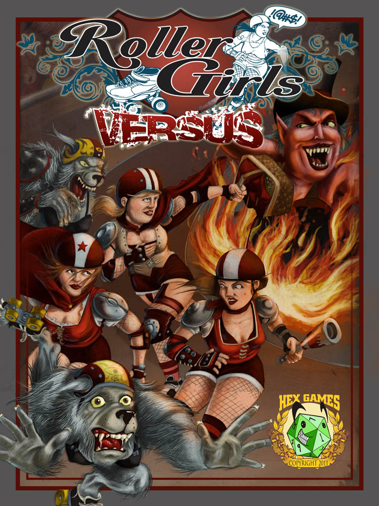
As promised, here's a little bit of my working process. This isn't everything, because I'm not including my initial thumbnail sketches or any of the work on the logo, and I'm terrible about actually documenting what I do during the painting process...but it'll have to do for now. ha-ha-ha!
First I get the brief, and (usually) a copy of the current version of the text. Depending on who I'm working for, the brief can be more or less specific. Ian is usually pretty specific about his ideas, but is also pretty cool about letting me choose from his list of things. The cover brief for Edison force looked like this:
In the grand tradition of Fratboys, I like the idea of a host of evil rising up. Some things that might be good
In the midground
Luther Burbank with his vegetable minions
Marie Curie with her radium gun
J. Pierpont Morgan and his accountant henchmen
An X-ray image of a man
Nicholas Roerich seated crossed-legged in midair using the power of Shambala to levitate
An early tank
In the air maybe an evil black dirigible, pterodacyls—small, far off
In the background, an ominous black figure, backlit by a sparking Tesla coil
In the foreground,
a ca. 1908 Thomas Edison backed by a team. Maybe a Roosevelt look-alike, an Annie Oakley, a guy in a leather flying helmet, a kid working a crystal set.
So as you can see, he gave me a lot of ideas to work with.

The first thing I do is start gathering reference. Mostly I'm looking for photos to cover the specific references, as well as poses, attitudes and inspiration. My reference files can get pretty big.

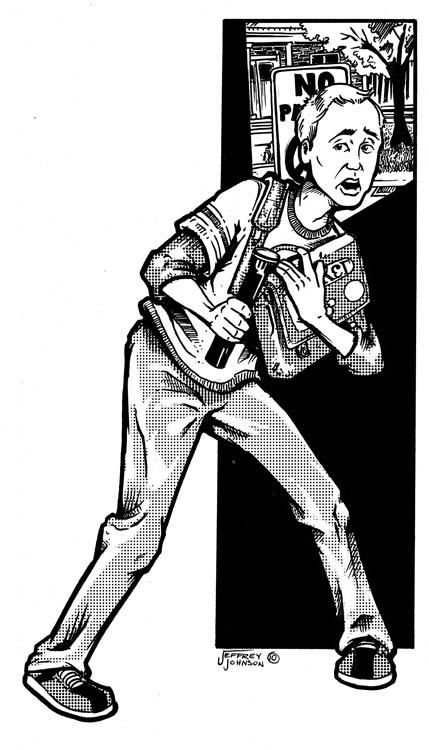
Like I said, I didn't scan the initial thumbnail sketches I did, exploring composition and content, and now I don't know where they are. This is my initial pencil drawing. Nothing too special, I use a 2h pencil for the initial lay in, and then go back over part of it with a 1 or 2b, to darken and finalize things.

After scanning in the pencils, I went ahead and did a composite using the graphic elements that I knew would be going into it. Basically, I wanted to make sure everything fit before putting too much work into the project.

Next I ink the pencil drawing. This defines all the major areas, as well as adding some textures and details to objects.

Finally, I color everything. Here's a detail of what the colors look like both with and without the inked lines.
One of these days I'll get more of a tutorial post together. The problem is that I'm still learning a lot with each new cover, so I don't always do it the same way. Hmmmm... Maybe that's the way it is with everybody though. I hope you all got at least some peak into the way I work through this.
Until next time, take care and be good!
Your friend,
Jeffrey

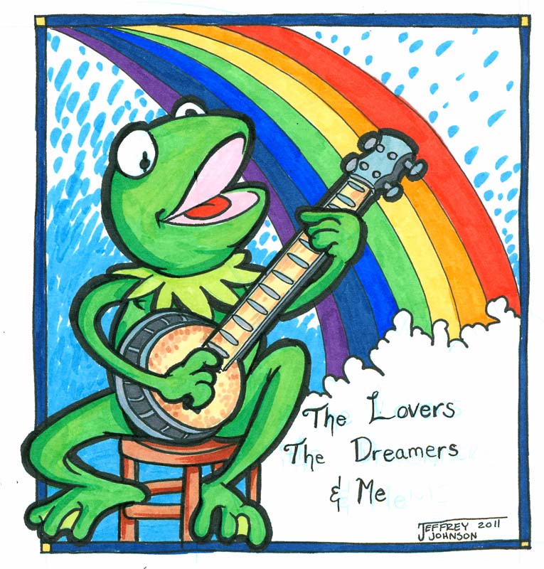 My Wife and I are long time Muppet fans. We enjoy them as much today as we did when we were kids, and we are all looking forward to the new movie coming out on November 23. In his speech to Doc Hopper at the end of the original Muppet movie, Kermit says: